Who?
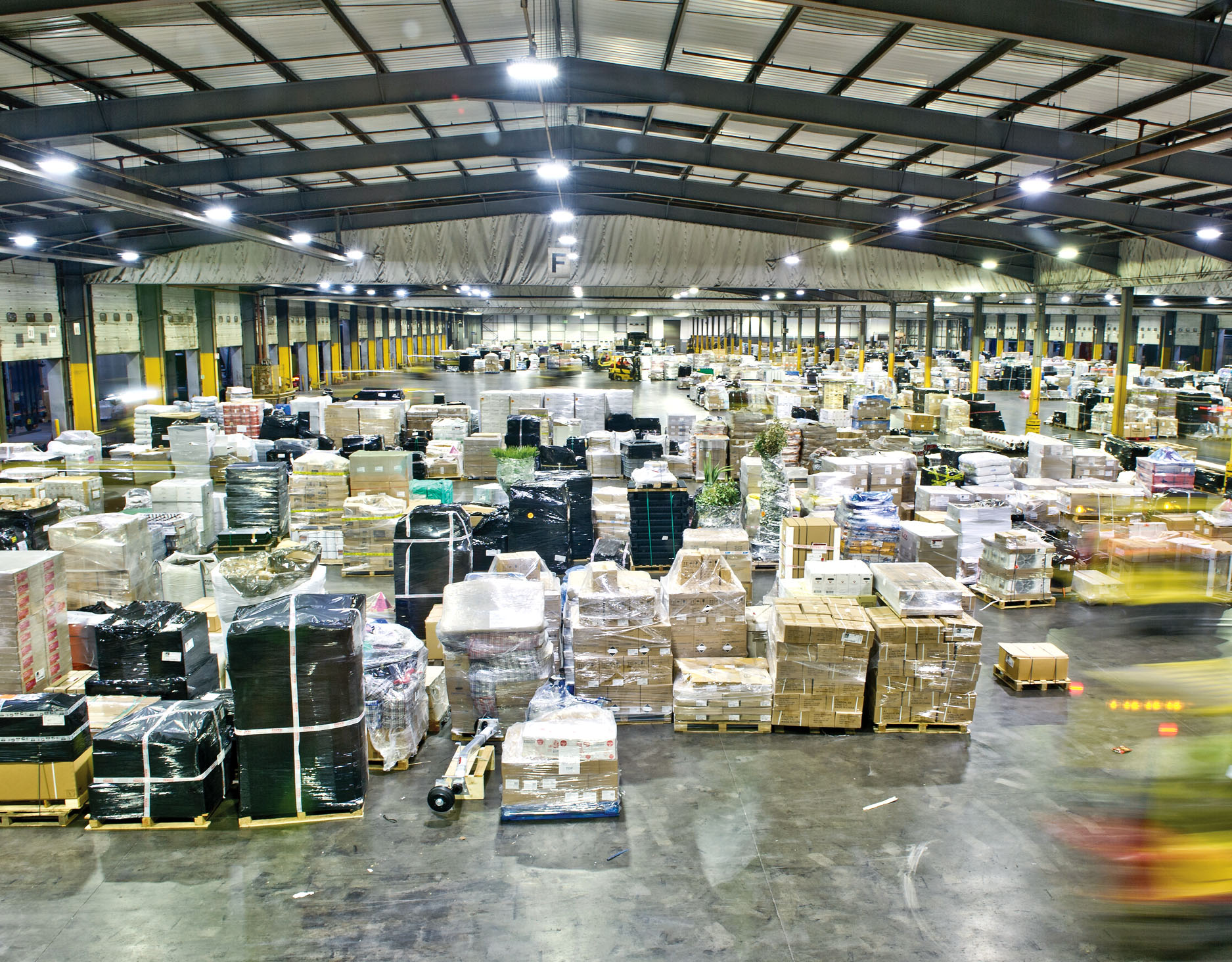
Pall-Ex is prominent network of hauliers formed in 1996. With its headquarters and central UK hub located in the Midlands, Pall-Ex transport thousands of pallets across the globe every day.
We were asked to help them transition the current branding with a new identity and suite of communications that would quickly build meaning and relevance for their existing, newly transferred and potential clients.
The Pall-Ex brand did not reflect the impact of its work for their clients or the passion and energy of its people. Our challenge was a sensitive yet essential one – reflect the businesses character and nature, while staying true to its heritage and belief in the power of its people and unique expertise to help and grow the network across the UK and throughout Europe.
What?
Through a series of workshops, we worked closely with the senior management team to establish, agree and articulate their brand through the core concepts of ‘Making the Difference’. This fundamental truth became the basis for a compelling brand narrative and the foundation for key talking points the team were able to use with all clients in the run up to launch.
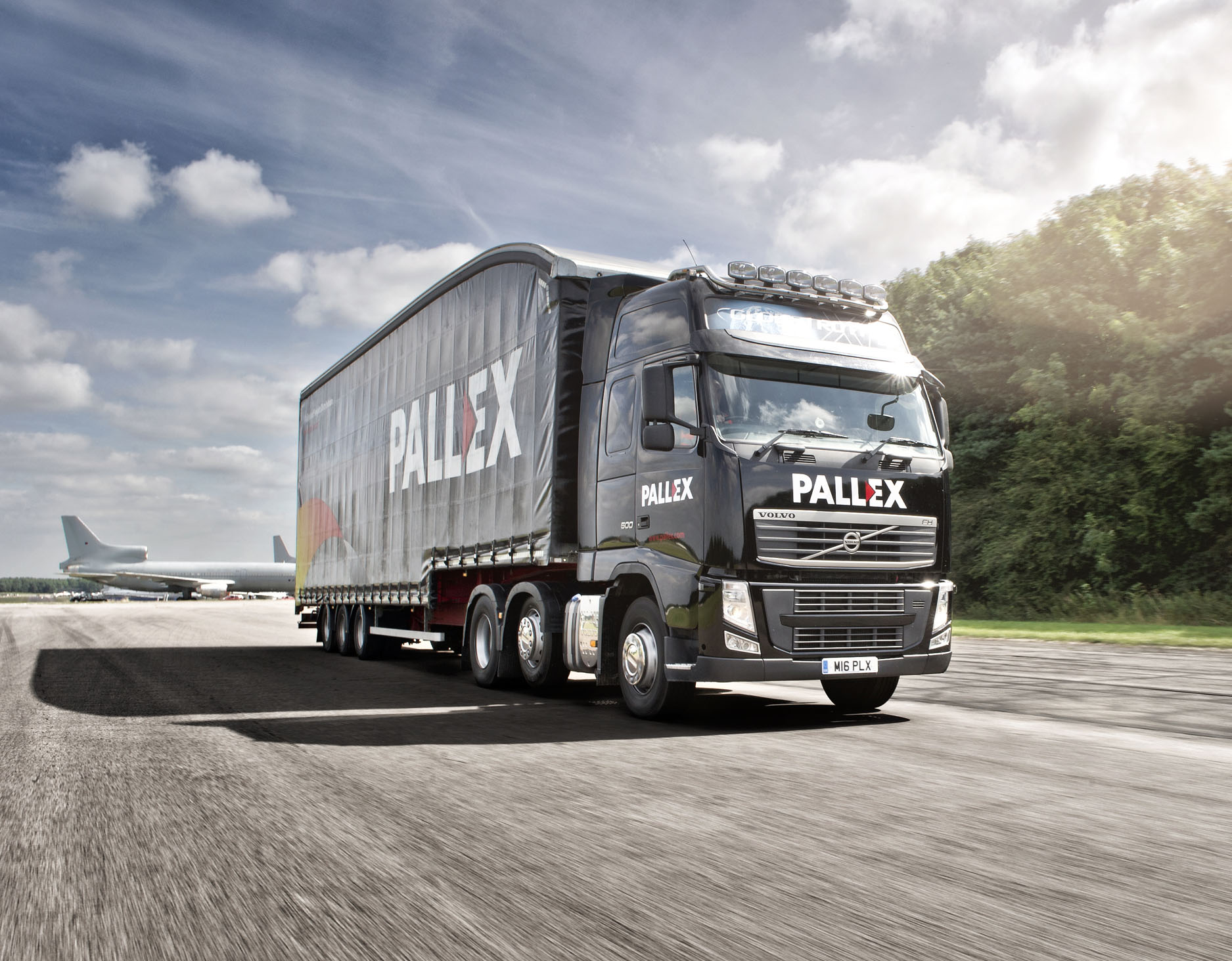
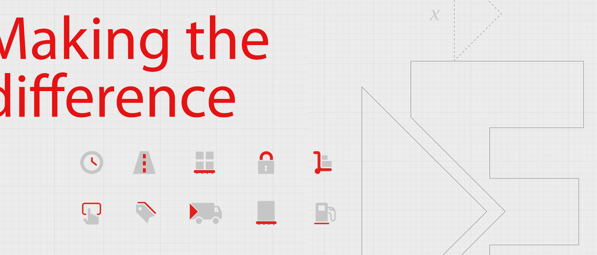
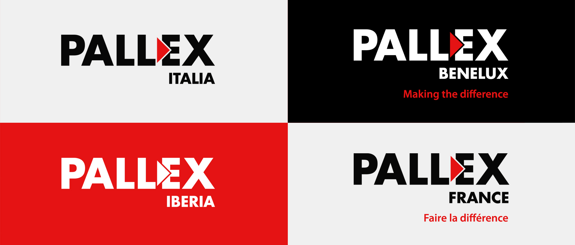
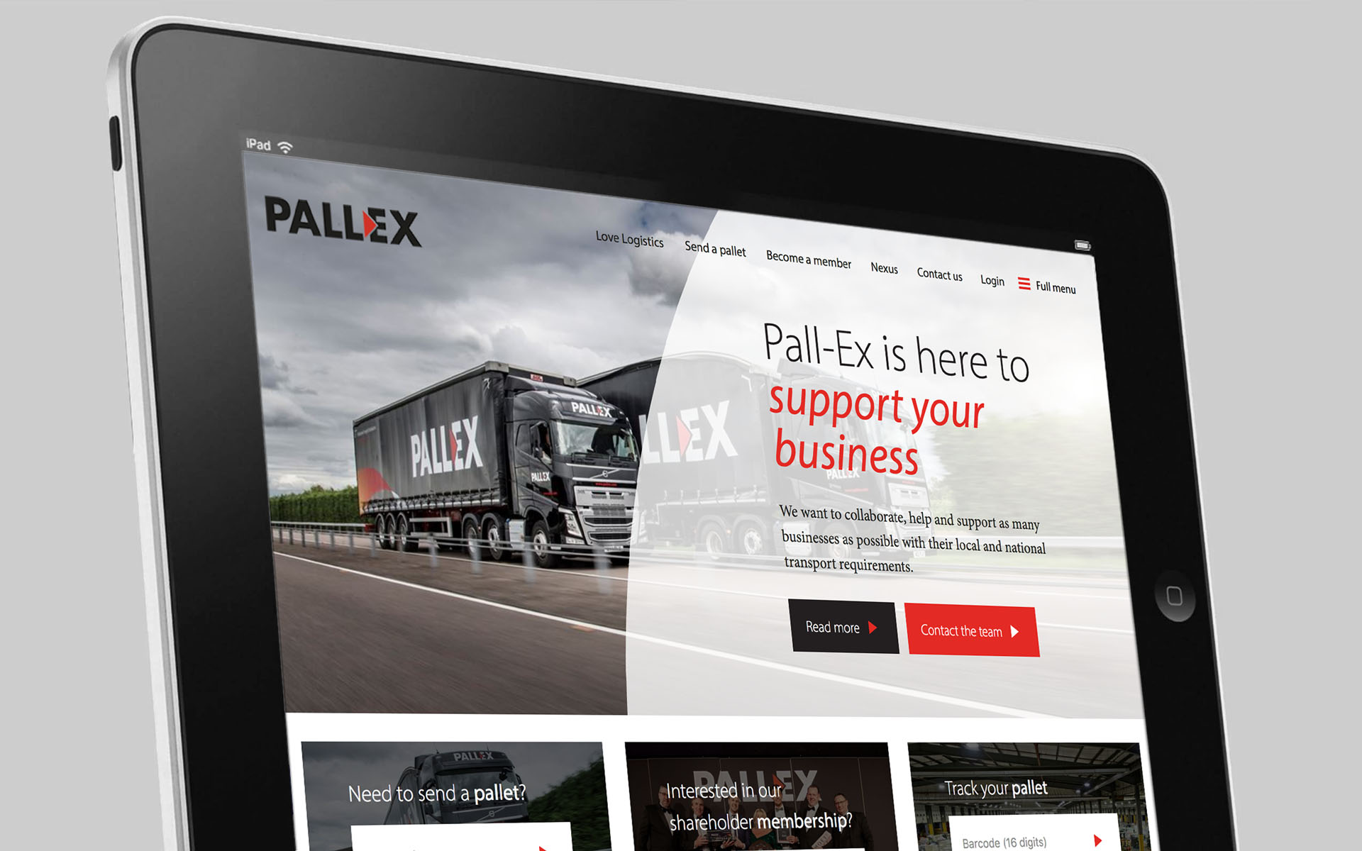
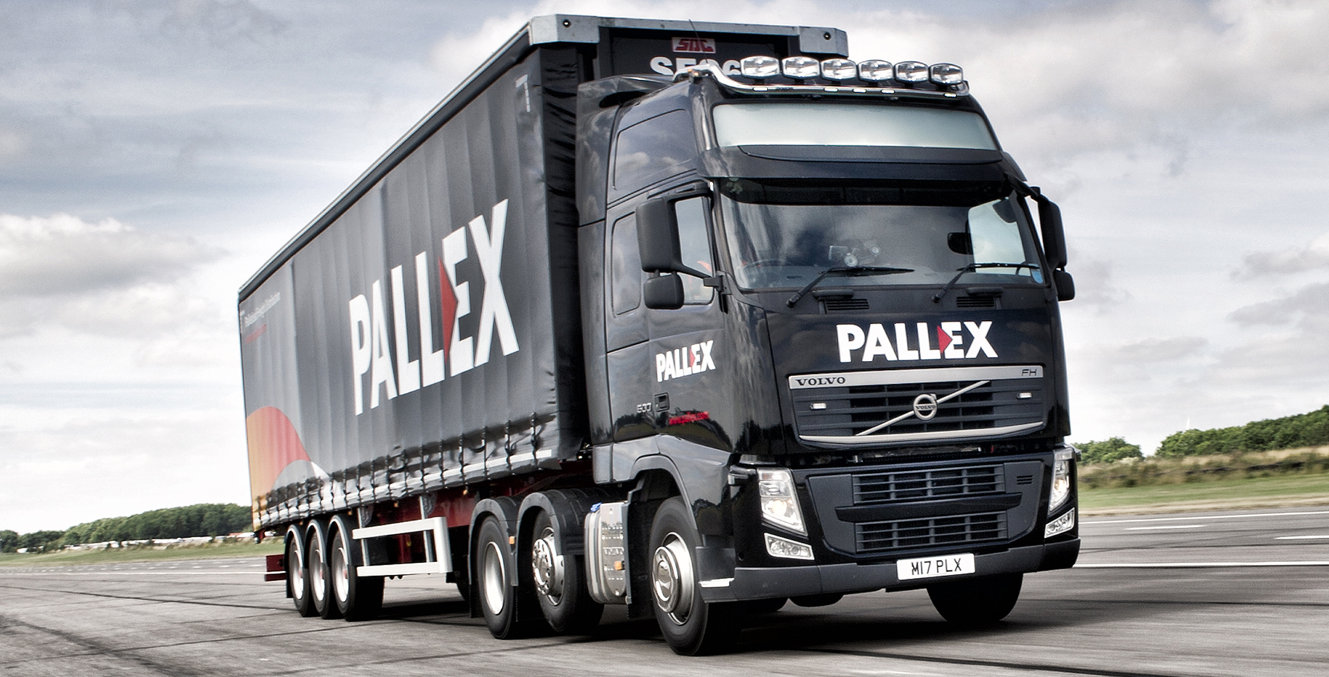
The new identity is an evolution and takes a universal symbol of direction and reinterprets it for the business as a distinctive wordmark. Symbolising leadership and control, the triangular polygon not only represent the logistics side of our business but the idea of progress and momentum.
The colours implicitly reflect the language of Pall-Ex without falling into a cliché. The yellow and red portray a positive energy; they are modern and vibrant. The black portrays strength and authority.
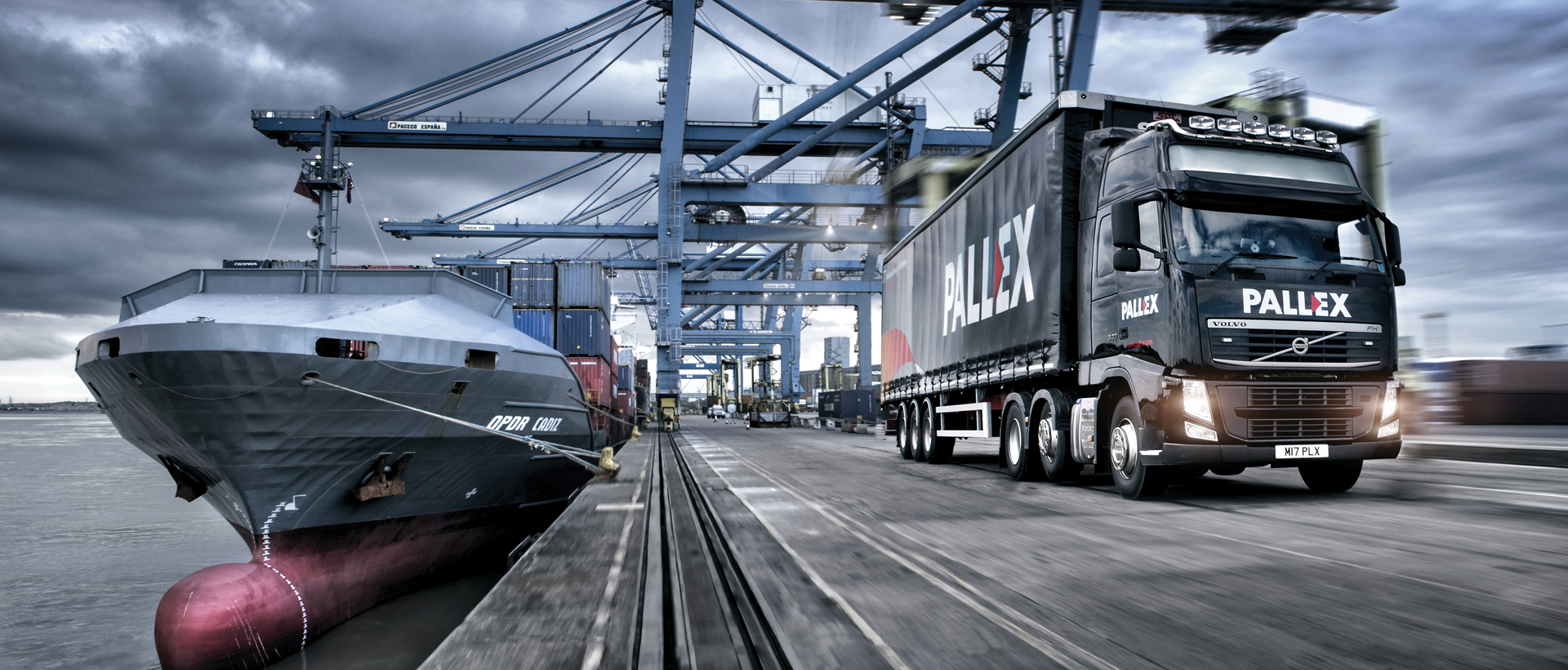
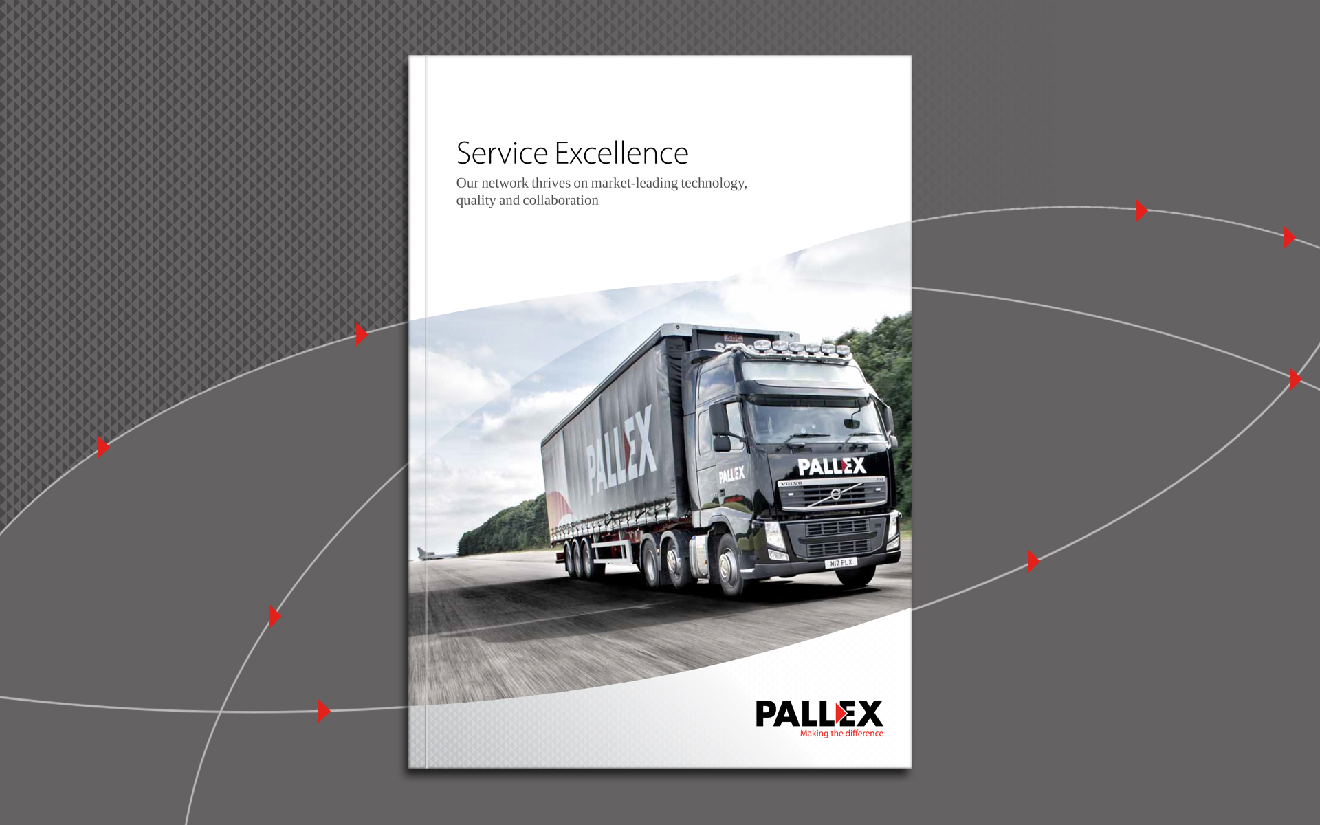
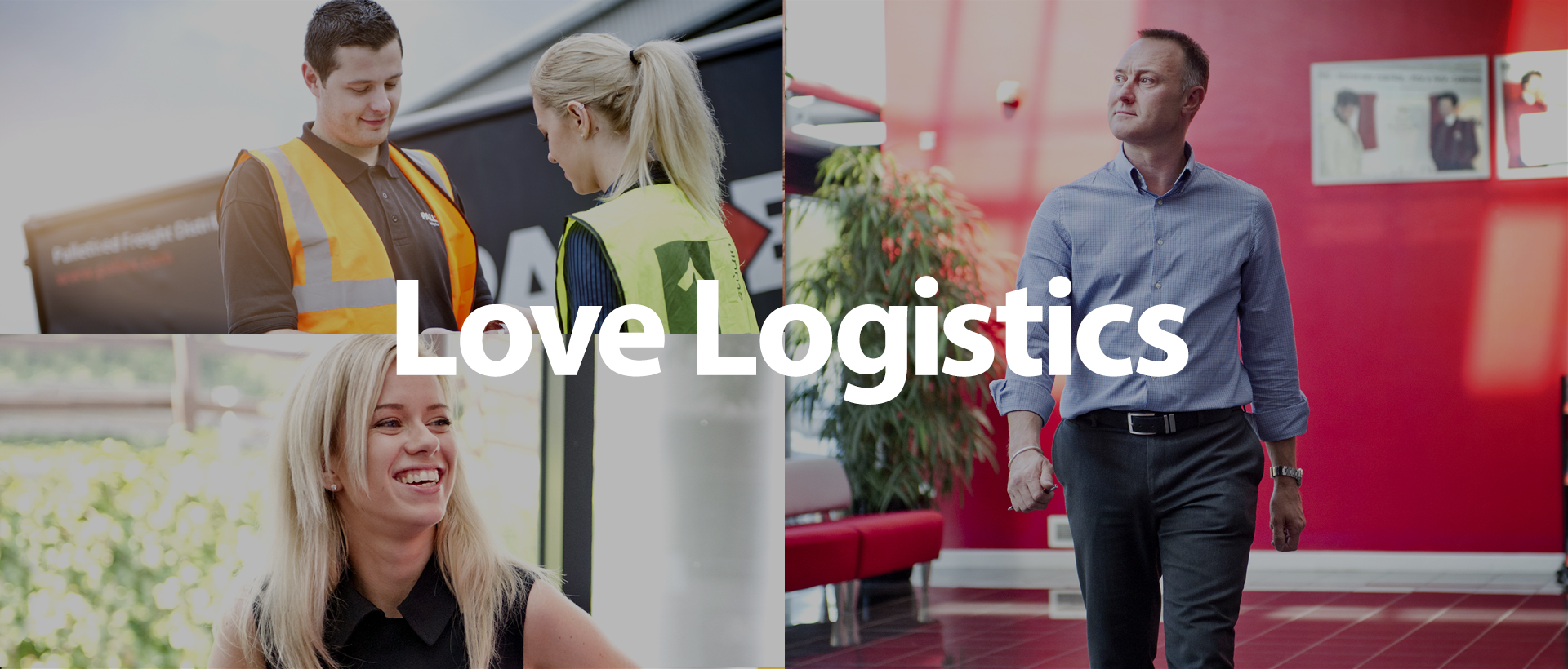
New photography also helped bring their people to the fore and reinforce the brand ideas.